brickmmo-branding
Home / In World Brands / The Hubbub Press Brand Guidelines
The Hubbub Press Brand Guidelines
Welcome to The Hubbub Press Brand Guidelines and Standards documentation. This guide is designed to help our team, partners, and the community understand and apply our branding consistently across various media.
A brand is not simply a logo or a tagline. It is a whole identity built on a foundation of values and goals that represent the brand. We want to communicate to our audiences in a consistent and engaging voice and look.
The Hubbub Press is a newspaper that exists inside the BrickMMO Smart City. The Hubbub delivers accurate, hard-hitting journalism on the issues that matter most, from city planning to energy debates. But it’s not all bricks and bureaucracy—it also celebrates the city’s creative side with features on arts, culture, and everyday moments of joy. Whether you’re looking for facts or fun, The Hubbub Press brings clarity, curiosity, and character to every column.
Please refer to the publications below for the brand guidelines which review the advertising themes we are using and how to execute these themes in our marketing materials. The quick reference guides are short, specific content sheets that help staff, faculty and their vendors use the brand correctly.
Website is available at hubbub.brickmmo.com
LOGOS
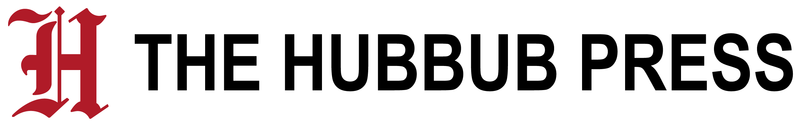
PRIMARY LOGO: |
SECONDARY LOGO: |
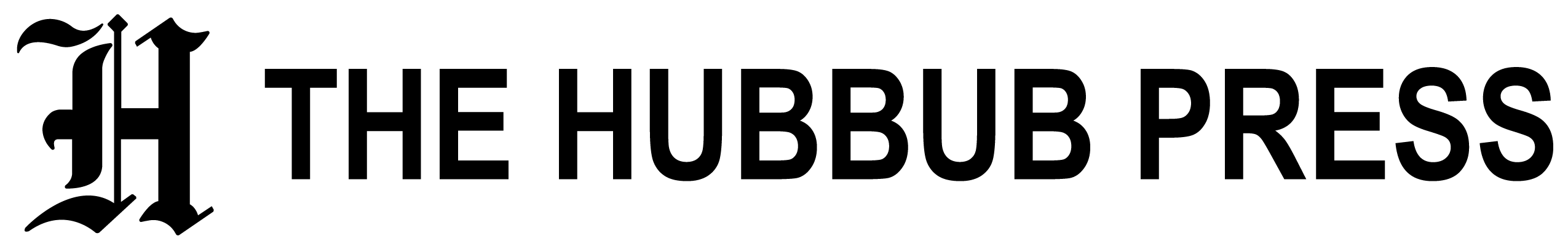
PRIMARY LOGO (BLACK): |
SECONDARY LOGO (BLACK): |
PRIMARY LOGO (WHITE): |
SECONDARY LOGO (WHITE): |
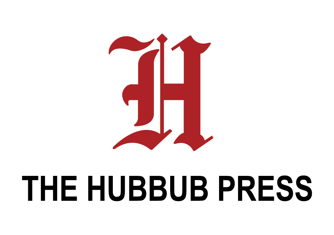
Coloured Logo Symbol
|
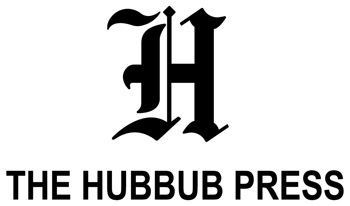
Monotone Logo Symbol (Black)
|
Monotone Logo Symbol (White) |
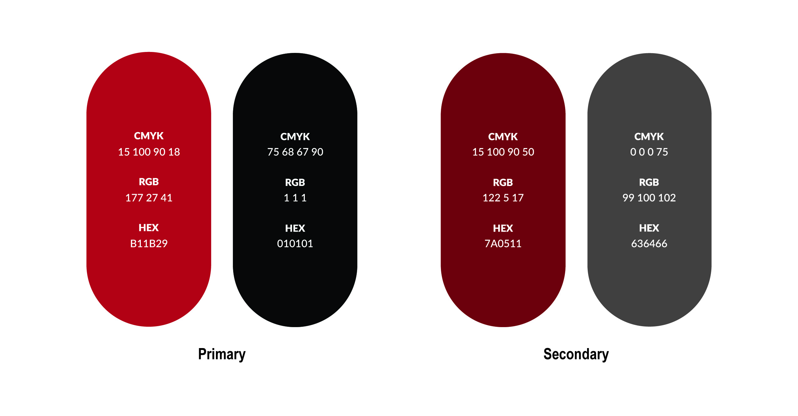
COLOURS
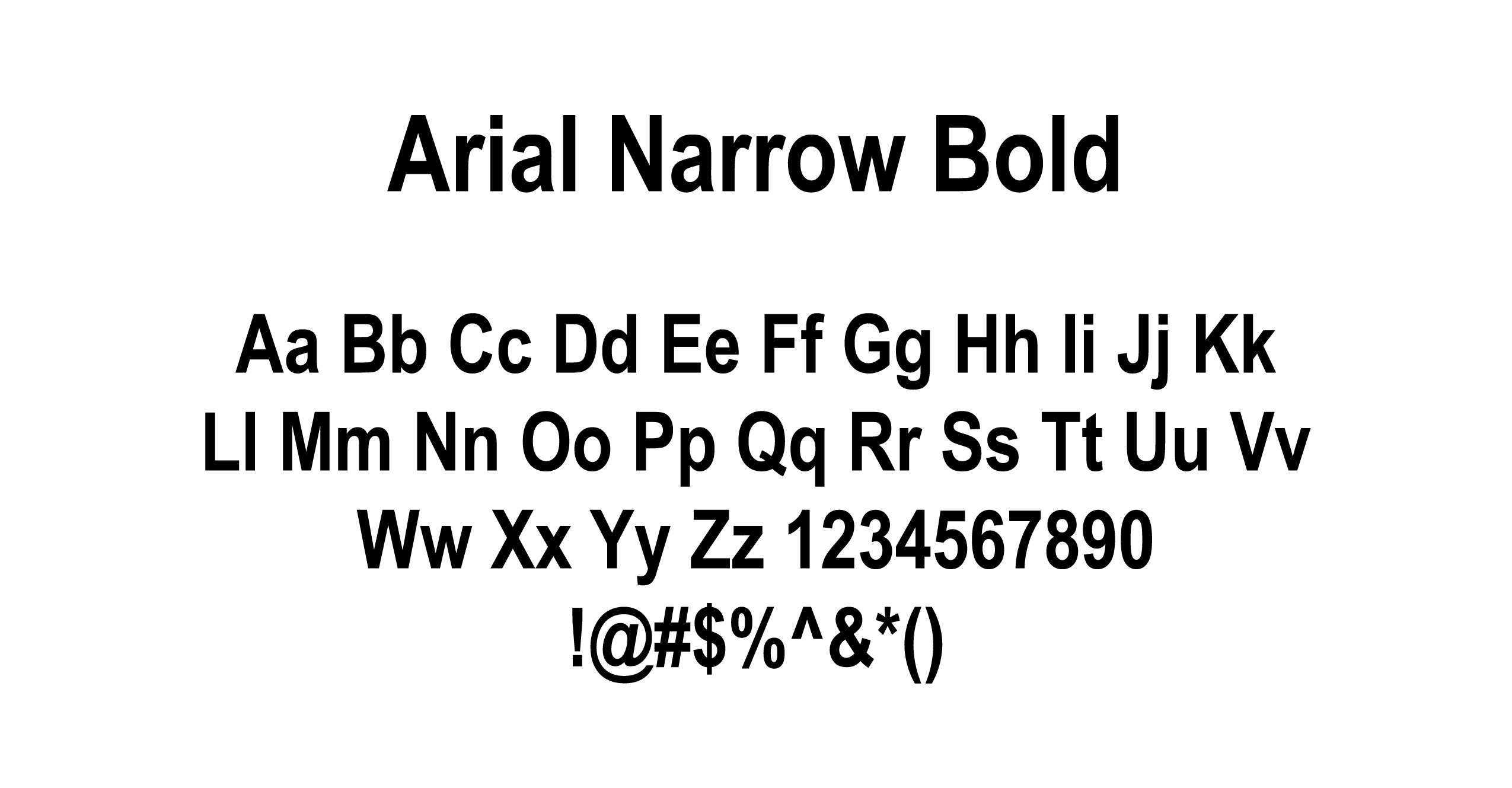
TYPOGRAPHY
![]()